Super Retail Group Careers Website - 2012
Super Retail Group's Careers Website includes information about the company and its culture, what to expect working there, and a facility for job searching and notifications.
Project Scope
Releasing Super Retail Group's new Corporate and Careers websites were two separate but concurrent projects which had different requirements, scope, functionality, budget, but a similar timeframe and design concept - my role was to project manage the release of both websites.
The previous careers website was set up in such a way that one site was masked to reflect each separate brand of the Super Retail Group's individual identity. The new website would pull together a blend of corporate identity plus brand identity, and combine them under a more attractive and easier to maintain system, and also used responsive design to make it accessible to all devices without needing to maintain separate websites.
New functionality included a web form for submitting enquiries. This functionality was replicated on the Corporate Website.
Overcoming Challenges
New scope was introduced when the third party supplier of the job search software (PageUp People) announced the platform was being upgraded to a cloud system. This meant the older system was able to be used, however support would be focused on the new platform. Going along with my recommendations the client agreed to pursue the new platform.
This did introduce a problem, however, as the design of job search pages relied on the older system being used and with neither the third party supplier nor the developers responsible for fixing it, the responsibility was mine to fix it. I relied on my own skills and connections with other developers to fix this functionality to the client's satisfaction.
My Involvement
- Project Manager, responsible for on-time and within-budget delivery
- Final Design and Functional Adjustments
- Quality Assurance & Testing
- Developer-to-Customer Liaison
- Content Population
- Front-End Development (JavaScript, HTML, CSS)
- Back-End Development
- Design Concept
Website Samples
Included below are some screen samples of the website at its time of release.

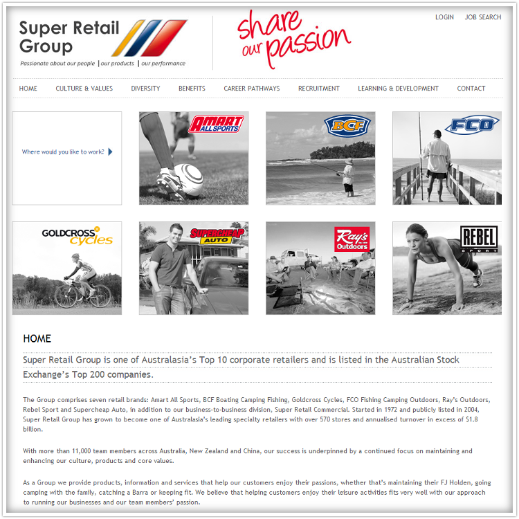
The home page. I populated the page with content here, and created the colour changing hover-over effect for the selection tiles in the center of the page.

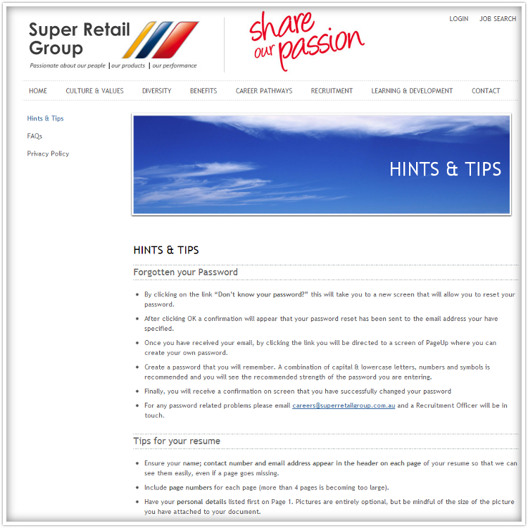
A sample content page from the website. This is a page I converted from a normal document to an HTML document incorporating the new design.

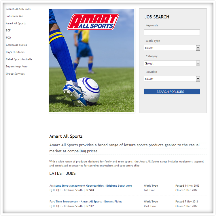
A sample job search and listings page. The job search form for these pages became unusable when we switched from the old job search system to the new one, as mentioned above, however I was able to match them to the design. In addition, for all brand specific job search pages the brand selection form item had to be removed. I was able to work this out in consultation directly with the app developers and implemented it on the site. My solution is still in place here. The output format for the job search results was also formatted by me in order for it to match the approved design of the site.

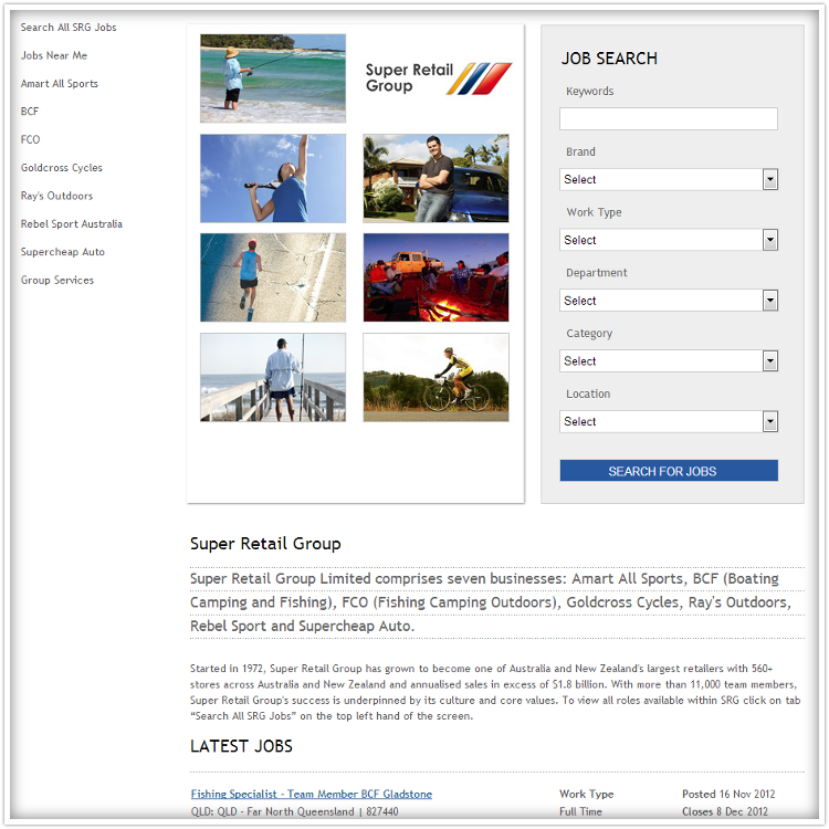
The company-wide job search and listings page. The job search form for this page is in its native form, with the brand selection included.
In addition, I fixed up the left hand side menu so it worked appropriately for the job search section of the website. Note it is different from the left hand side menu from a normal content page.
Conclusion
We had a successful release of the website, on time and within budget. The site still exists and has evolved since my involvement.