Ray's Outdoors Website Content Pages - 2012
Another Australian destination store for camping, fishing, and the outdoors in general, the Ray's Outdoors E-Commerce website is a treasure trove of merchandise, information, and for me, adventure into content creation and experimentation.
Overview
Unlike the market leader in Australia for the leisure retailing industry BCF, Ray's Outdoors' website was not a dominator of the Hitwise charts (yet). Only a recent acquisition into the Super Retail Group family, and with a recently revamped website, Ray's was only climbing out of the mud in web traffic rankings.
I had a lot of fun working for Ray's Outdoors along side their marketing coordinator. He was full of ideas and always keen to implement them and up the website's SEO. In turn, I was keen to take the ideas and turn them into something real on the website.
Increasing Rays' web traffic became an exciting challenge for us, and any increase was inspiring. Had I stayed on at Super Retail Group further increases in traffic were to become a new KPI for me.
Pat's Videos
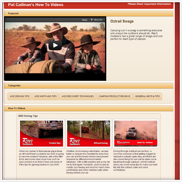
This project was one of my first, and it popped up again and again throughout my time with the company. Originally tasked with adding new videos to the small collection, I noticed that despite the multitude of rich information in the videos there was not much on the page that could be read and catalogued by search engine robots. The mission to increase the page's profile on the web began. Step 1 was for each video to be coupled with a keyword-targeted description.
As videos kept being produced and uploaded there came a need for categorisation - with that coming more keywords. The page went through a couple design phases before this one (still in use as of May 2013).

The design utilised style motifs from other parts of the website, containers for a feature video and each category of videos, and a lightbox presentation for individual videos. Brief descriptions of each video helped increase the page's profile to search engines.
Video Tent Guide
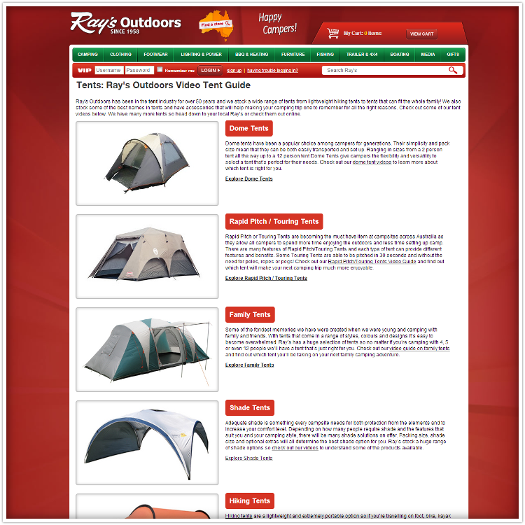
This was one of my favourite undertakings. As busy content creators, Ray's wanted each of their tents to have an associated video detailing how the product works, pitching instructions, and other information. Due to the frequent changes to the content I created an application that exported the entire website section into HTML documents ready for uploading to the live server. The raw data was stored in an Excel document and could be activated at any time to update the entire section.
Borrowing what I had learned from the Pat's Videos section and applying knowledge about SEO, I set about creating a structure on the website's folder hierarchy and design for the required pages.

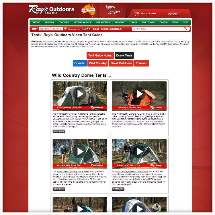
The design used existing attractive product photography and colour-changing, shadow-inducing hover effects to give it a more interactive feel for users. A home page and category page structure was used to enhance the SEO profile.

Videos included a custom play button superimposed on the still shot which interacted when hovered over. When the user clicked on the videos they would open up in a lightbox. The pages included a bright menu at the top for on-page navigation and to return to the home page.
Marketing Promotional / Info Pages
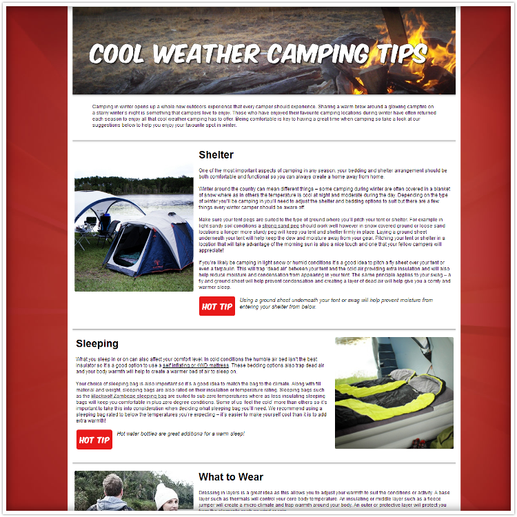
These pages were valuable marketing tools cleverly disguised as free info. Their purpose was twofold: draw traffic to the website, and encourage sales of specific items. I was approached for a simple design template and created the following concept.

A simple concept - use a few "lifestyle" images, rich text descriptions, and use a stepped left/right design for each section.